Next.js Responsive Images: How `srcset`, `sizes`, and `/_next/image` Turn One Upload Into the Right File for Each Screen
What those many URLs in DevTools mean, what the browser actually downloads, and when a plain `<img>` is enough.
Published on

You drop a single PNG into your project—maybe a hero photo or a blog screenshot—and everything looks normal in your code. Then you open Chrome DevTools, click the image, and suddenly there is a long list of URLs. It feels like Next.js duplicated your file. It did not. The framework is setting up responsive image delivery: one source file, many possible optimized versions, and rules that let the browser pick the smallest file that still looks sharp on that screen.
This guide explains that machinery in plain language—no React wizardry required. If you are still piecing together how a modern site is built, our React, Next.js, and App Router overview maps what JavaScript, React, Next.js, and URL routing each handle on a typical Next.js site—the broader stack your pages (and this image behavior) run on.
Scope note
Written for modern Next.js sites using the next/image component. Exact width steps, default quality, and supported output formats can vary slightly by Next.js version and next.config.js; use DevTools on your own project to confirm the URLs you see.
You uploaded one file—why does Inspect Element show so many URLs?
In your editor and in Git, you still have one image file—say /public/blog/hero.png. What changes is the HTML that Next.js emits at runtime. The Image component automatically adds a srcset attribute: a list of candidate image addresses at different widths (and often a separate src fallback). Each candidate typically points at the Image Optimization API path—by default /_next/image—with query parameters such as url, w (width), and q (quality).
Your file vs. the markup the component outputs
Think of your upload as the master print. The srcset list is a menu of smaller prints the browser may order—640 pixels wide, 750 wide, and so on—not a stack of files you must maintain by hand. Next.js generates those optimized variants when a given size is requested (and can reuse cached results afterward, similar in spirit to how HTTP caching keeps repeat visits fast).
Elements panel vs. Network panel
This distinction saves a lot of confusion. The Elements tab shows the full srcset menu baked into the page. The Network tab shows what actually traveled over the wire—usually one image request for that slot (plus, sometimes, a tiny blur placeholder). Seeing ten URLs in markup does not mean ten downloads on first paint.
| Where you look | What you see | What it means |
|---|---|---|
| Elements → <img> attributes | Long srcset, src, sizes, alt | All options the browser may choose from |
| Network → Img filter | Often one /_next/image?... request | The variant actually downloaded for this viewport |
| Your /public or import folder | One original file | What you authored; the rest is generated on demand |
What is srcset?
srcset is a standard HTML feature (not unique to Next.js) that tells the browser: "here are several versions of this image at different widths—pick the best one." Each entry pairs a URL with a width descriptor such as 640w (640 CSS pixels wide). The MDN img reference documents the syntax; Next.js fills it in for you when you use next/image.
A menu of sizes, not a pile of downloads
Without responsive images, every visitor—phone, tablet, or ultrawide monitor—might download the same 2 MB file. With srcset, the browser can request a tighter crop of bytes when the image only displays at 400 pixels on screen. That is the core web performance win, and it is why blog heroes and product shots on modern sites rarely use a naked <img src="huge.jpg"> anymore.
What does the sizes attribute do?
If srcset is the menu, sizes is the note you leave for the browser: "on a phone this image will be about X pixels wide; on a desktop, about Y." Without that hint, the browser may assume the image spans the full viewport width (100vw) and download a larger file than necessary—wasting bandwidth and slowing how fast the page feels.
The hint most sites get wrong
Next.js documentation is explicit: use sizes when the image is responsive—especially with the fill prop or CSS that stretches it. A typical blog hero might use something like (max-width: 1024px) 100vw, 42rem, meaning "on narrow screens, treat it as full width; otherwise cap around 42 rem." When sizes is missing on a responsive layout, Next.js may generate a simpler density-based srcset (1x, 2x) instead of the full width ladder—fine for fixed icons, wrong for fluid heroes.
The web.dev responsive images guide walks through how to read and write sizes expressions; the math is easier than it looks once you match them to your real CSS layout.
📱 The Retina Screen Factor: Device Pixel Ratio (DPR) Math
You might write a perfect sizes hint telling the browser that an image slot is exactly 360px wide on mobile. But when you inspect the Network panel on an iPhone, you see it downloading a 1080w file.
Modern high-density displays use a multiplier called Device Pixel Ratio (DPR). An iPhone or high-end desktop monitor has a DPR of 2x or 3x, meaning it squeezes multiple physical screen pixels into a single layout CSS pixel to keep text and graphics sharp. The browser automatically handles the math behind the scenes:
Armed with that target, the browser skips the lower 360w candidate and grabs the closest match to 1080w in your srcset ladder. Your layout hint is working exactly as it should—it just factors in screen density so the final image does not look blurry.
What is /_next/image?
When you see long image addresses in DevTools, they often start with /_next/image. That is not a folder of extra files sitting next to your PNG in /public. It is a built-in route on your Next.js site—an image optimization endpoint that prepares the right version of your picture when a visitor's browser asks for it.
Everyday analogy: the neighborhood kitchen
Picture a small restaurant with one pot of soup in the kitchen—that is your one image file. The menu only offers cup, bowl, or bread bowl (those are the widths in srcset). The server checks whether you are at the counter or a booth (sizes), so the kitchen knows how big a portion to serve. When you order, the cook ladles out just that size. That step is /_next/image: same soup, portioned for you. If someone else orders the same bowl right after, the cook may reuse one already plated—that is caching. The kitchen did not make twenty pots at opening; it responds order by order.
How to read the URL in plain English
A typical optimized address looks like this:
/_next/image?url=%2Fimages%2Fhero.png&w=750&q=75
url— which source image to use (often a path under/public, URL-encoded in the query string).w— target width in pixels for this request (the size entry the browser chose fromsrcset).q— compression quality (commonly around 75 by default; higher means larger files).
The server reads your original file, resizes and compresses it to match those parameters, and may serve a modern format such as WebP or AVIF when the browser supports it. The response can be cached so the next visitor who needs the same width does not pay the full processing cost again—similar to how a CDN or browser cache reuses work, as described in our HTTP caching guide.
What it is not
/_next/image is not a duplicate upload and not something you edit by hand. You do not commit dozens of variants to Git. You keep one source asset; Next.js generates derivatives on demand (or from cache) when each srcset URL is requested. If you need the raw file with no optimizer in the middle—static export quirks, special hosting, or a fixed asset that must never change—use the unoptimized prop on next/image or adjust image settings in next.config.js. The default path can also be renamed via the images.path config if your host requires it—see the Next.js Image documentation for details.
What the next/image component adds on top
The React Image component is what wires your file into that pipeline: it outputs the srcset, sizes, and /_next/image URLs so you do not hand-write them. It also handles concerns HTML alone does not solve well out of the box.
Width ladders, quality, and config
You can customize which widths appear via deviceSizes and imageSizes in next.config.js. Typical defaults include common viewport breakpoints (640, 750, 828, 1080, and up) plus smaller steps for thumbnails.
Swipe horizontally or scroll to the right to view the full screenshot.
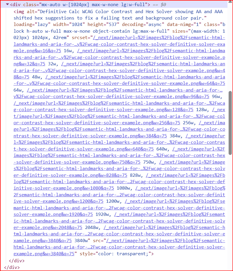
The component also encourages layout stability. Set explicit width and height, or use fill inside a parent that already has a defined size, so the browser holds space before the file loads and surrounding text does not jump. next/image requires an alt value: describe what the picture communicates (not the filename), so assistive technology and search engines get useful context. Images also sit inside a larger page layout—our semantic HTML, landmarks, and ARIA guide explains how to structure regions and navigation so screen reader users can reach your content without wading through every link first. For a hero that is likely the largest thing on first paint, add priority or preload so default lazy loading does not delay it.
Is this actually faster? Tradeoffs to know
For most content sites—blogs, marketing pages, documentation—responsive optimized images are a net win. Mobile users download fewer bytes; desktops still get crisp assets; and you avoid manually exporting six PNG sizes every time you swap a screenshot. That lines up with why teams measure delivery costs in tools like our cloud egress calculator and CDN ROI calculator: smaller payloads mean less transfer spend over time.
Wins, costs, and when a plain <img> is enough
Wins: right-sized downloads, automatic modern formats, lazy loading by default, and less layout shift when dimensions are set correctly. Costs: the first request for a given width may wait on server-side processing; misconfigured sizes can still waste bandwidth; and very large source files remain a bad starting point—optimization cannot invent detail from a tiny upload stretched huge. Plain <img>: fine for decorative icons, SVGs, email templates, or assets that must never pass through an optimizer. For photos and screenshots that affect load speed, next/image is usually the better default.
If you are validating visual quality as well as bytes, pair this workflow with our WCAG contrast guide and the WCAG color contrast solver so images stay readable—not just lightweight.
Definitive Summary
- You still author one image file; Next.js emits a srcset menu of URLs.
/_next/imageis the on-demand optimizer route—not extra files in your repo. - Elements lists every candidate; Network shows what was actually downloaded—typically one request per image slot.
- sizes tells the browser how wide the image displays; wrong values cause oversized downloads or soft images.
- The optimizer resizes, compresses, and can serve modern formats; set
unoptimizedwhen you need the raw file end-to-end. - Use meaningful
alttext, correct dimensions, andpriorityorpreloadfor hero images; reach for plain<img>only when optimization is not appropriate.